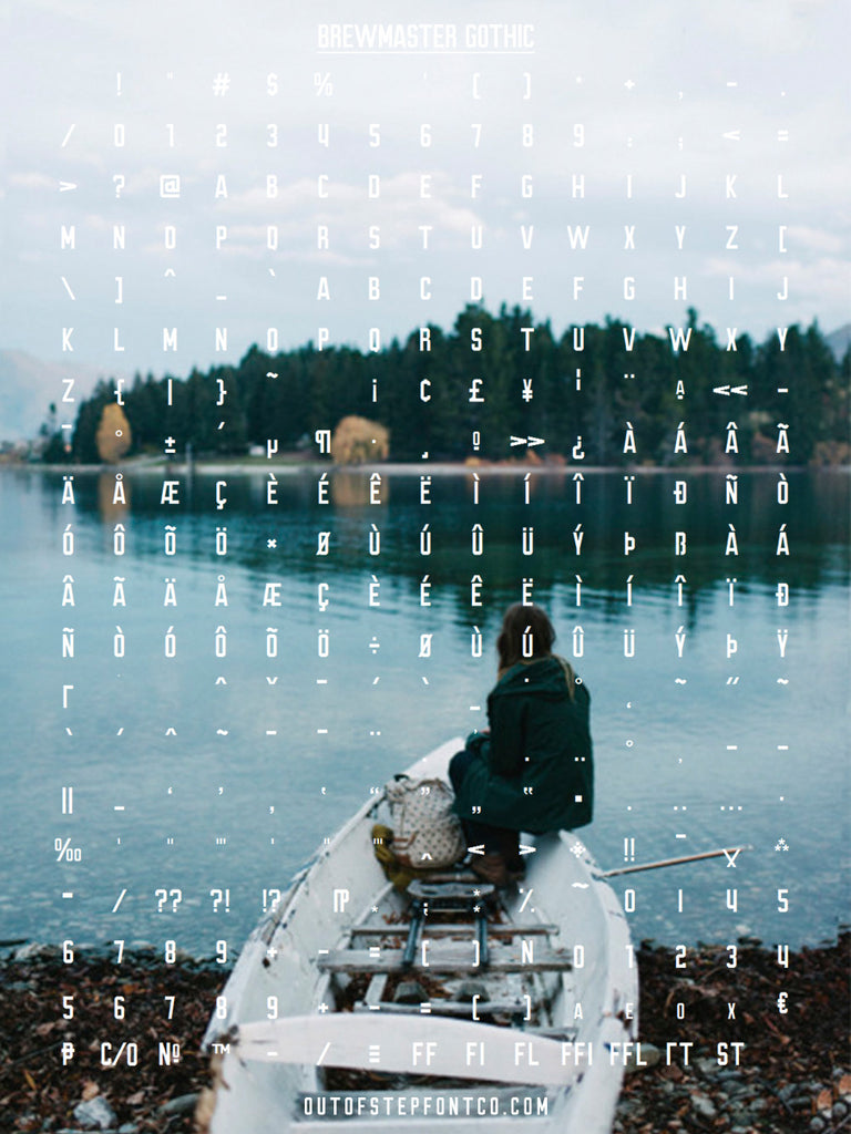
Brewmaster Gothic: new grotesque gothic with accents and alternates

My father lives downtown each summer, next to a brew pub. Over its outdoor patio, there is a huge mural featuring its name. The pub name is painted in 8-foot tall letters on the brick facade. I love the letters, the look, the shape. I've always wanted to add something similar to our collection of fonts on offer.
One day while reviewing our existing fonts, I noticed that our Turbonacular font had many of the same shapes, but had been built with round corners, instead of square corners. So the first step was going back to the original source files and squaring all the corners.
After the corners were squared, we still had a number of characters, like the K and A that had been interpreted as round letters. These characters were redrawn with grotesque gothic angles.
The next step was to correct the proportions where two round edges met, like on the 3, B, and R. Next came the accented characters (missing from Turbonacular), and and punctuation / special characters that had not been created.
The end result is a firm, structured gothic with a lot of character, a huge complement of accented and special characters, full punctuation set, and an alternate set of uppercase characters in the lowercase.
The full version of Brewmaster Gothic is now available to purchase, and of course you can download the free version from our Resource Library.


